Conceptualising and designing some illustrations and spot illustrations for a fintech brand named Assetment
Involved coming up with original ideas and visual concepts, sketching and creating polished, final illustrations that effectively communicate the desired message and align with the overall aesthetic of the brand.
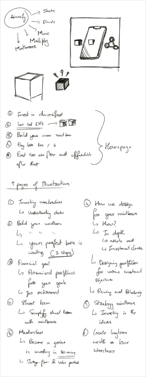
Understanding the requirements for the project, starting from the users, context and UI layout where the illustrations would go. Which will give me the idea for exploring some inspirations
In the early stages of the design process, I am seeking to understand the core message that the brand wants to convey through illustrations to its users.
By doing so, I can determine the direction that the illustrations should take.
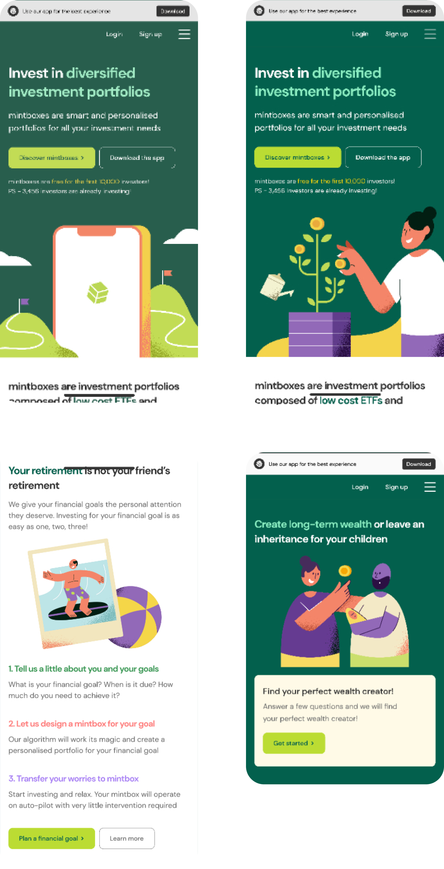
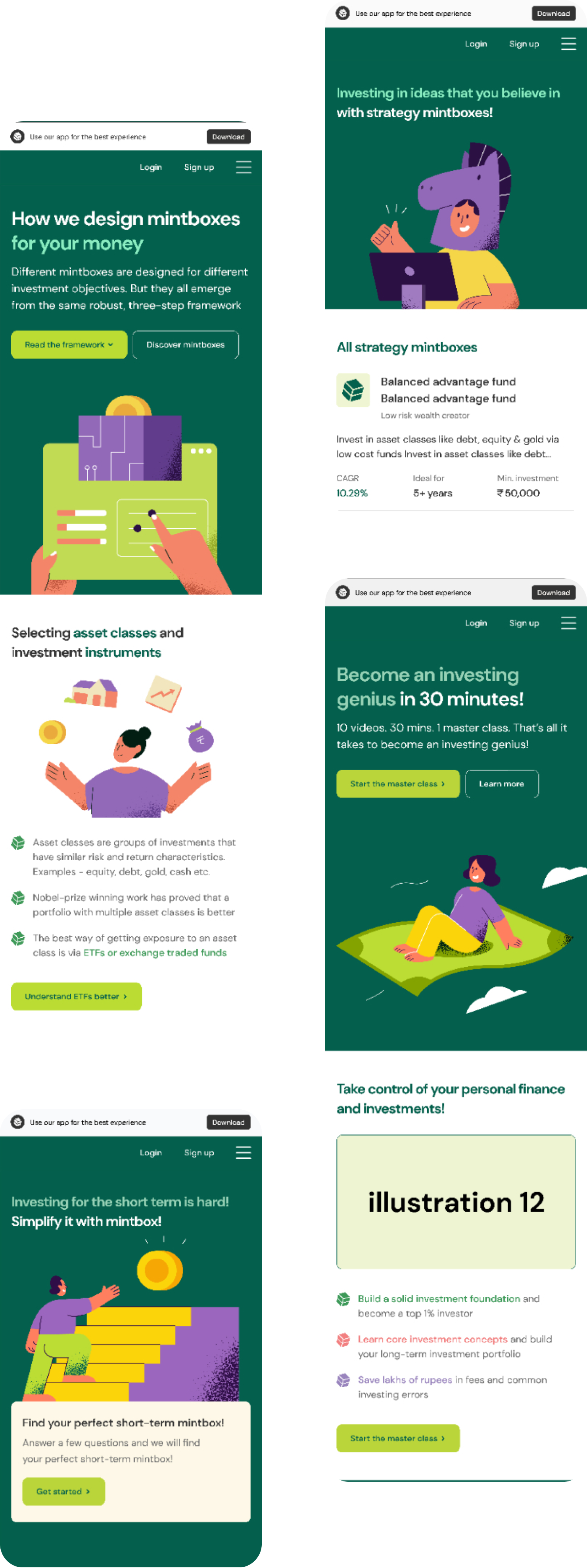
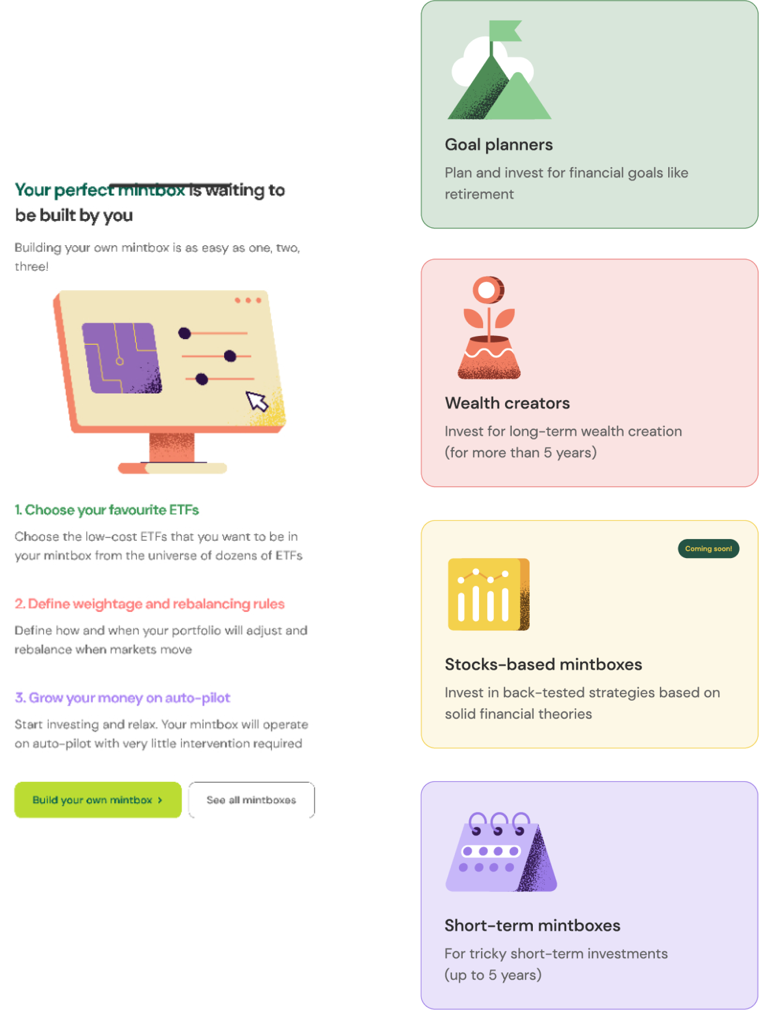
During this phase, we learned that the client wants the illustrations to be simple, relatable, and vibrant. Since this is a fintech brand, the illustrations should also focus on themes such as success, money, and growth.
Using characters performing relatable actions can help convey complicated financial concepts in a more approachable and understandable way.
Money-related topics can be intimidating and complex, but using simple and playful characters can help anyone better understand the product and feel less intimidated.
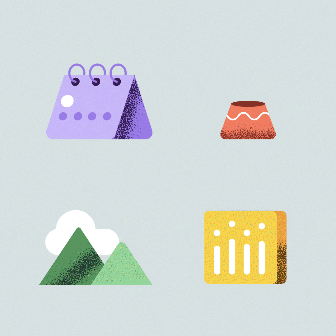
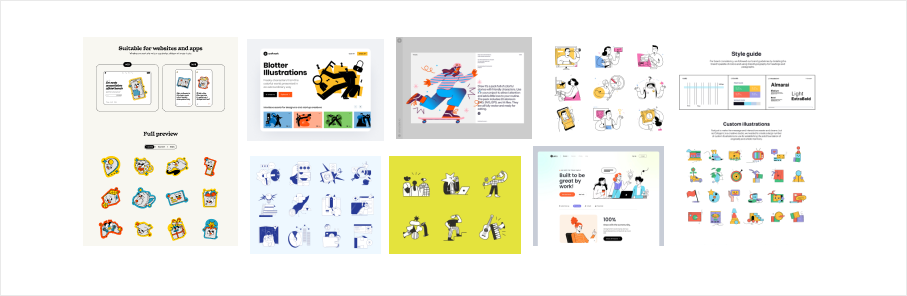
Following the initial phase, I began searching for simple, geometric illustrations that could be easily reproduced in both static and motion formats.
I collected a range of illustrations that aligned with the concept and atmosphere of the brand and product, and analyzed textures, lines, shapes, and flow to determine which elements would work well in the illustrations I planned to create.
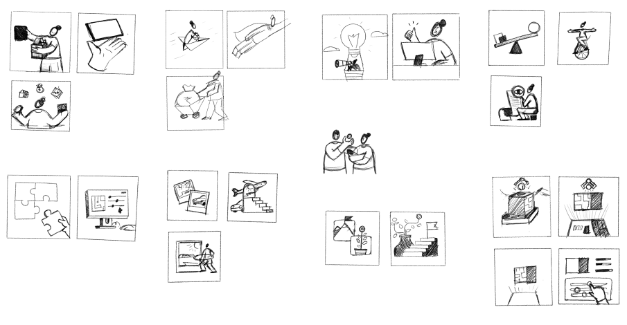
To communicate my creative process and gather feedback, I created low-fidelity sketches that outline my ideas for the illustrations. These sketches serve as a starting point for discussion and allow for adjustments and improvements to be made before moving on to the final design.
Sketching also helps me to get all of my ideas out on paper and make space for new ones to emerge.
Choosing colors can be challenging, so it can be helpful to view the illustrations in grayscale first. This allows you to focus on contrast between shapes and colors without being influenced by specific hues.
After experimenting with different color combinations, I tested them out with the UI design to see which combinations worked well together.

Incorporating micro animations into illustrations can bring them to life and add a sense of craft and personality to the brand. These small, subtle animations can help to make the illustrations more engaging and dynamic, and can also help to reinforce the overall character of the brand. Whether it's a character's facial expression changing slightly or an object moving slightly within the frame, micro animations can help to add depth and dimension to the illustrations and bring them to life in a way that static graphics alone cannot.